
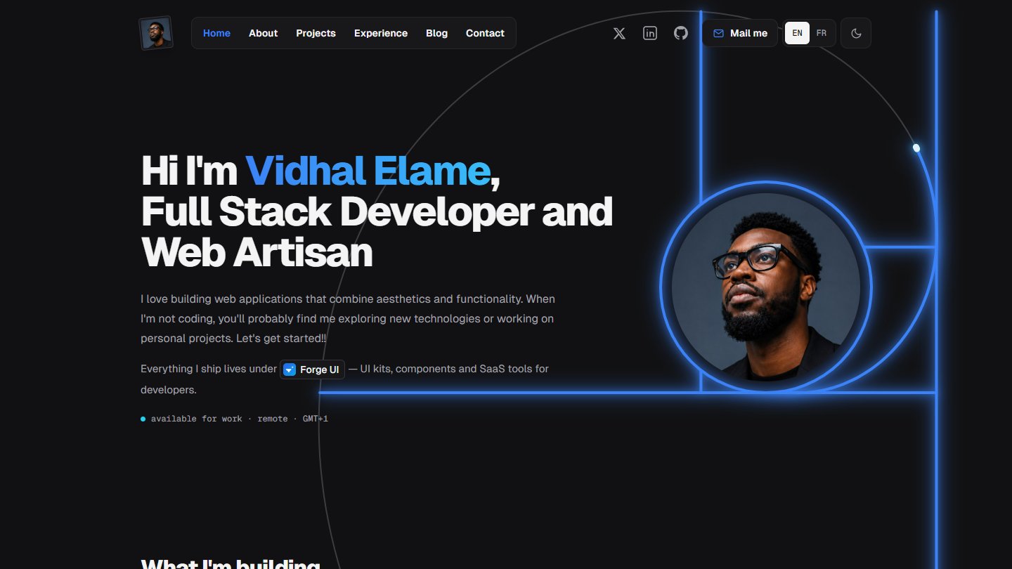
Every portfolio guide says the same thing: never make people wait. And they're mostly right. But when I rebuilt this site, one thing was non-negotiable — the opening sequence, the five seconds where marsile'Dev burns across the screen with a hundred particles behind it.
Why it stayed
A portfolio is not a SaaS landing page. Nobody arrives here in a hurry to buy something; they arrive to form an impression. The intro is that impression — it says this person cares about motion before a single word is read.
What the guides are really warning against is waiting with nothing to show after. So that's where the work went:
- The pages behind the intro got a construction frame — vertical rails and
little
+crosses at the section joints, like a blueprint - Project cards were rebuilt with monospaced stack badges and a light beam that rides the border of the featured one
- The photo carousel became a double marquee that drifts in opposite directions and pauses under your cursor
The lesson
Don't delete the thing that makes your site yours. Delete the noise around it, then frame it properly. Rules are averages; portfolios are outliers.