
Why my profile needed a redesign
A GitHub profile is often the first thing a recruiter or another developer opens. Mine listed tools as badges and little else. I wanted a visitor to understand in five seconds who I am, what I build, and that I ship.
A banner that moves — without JavaScript
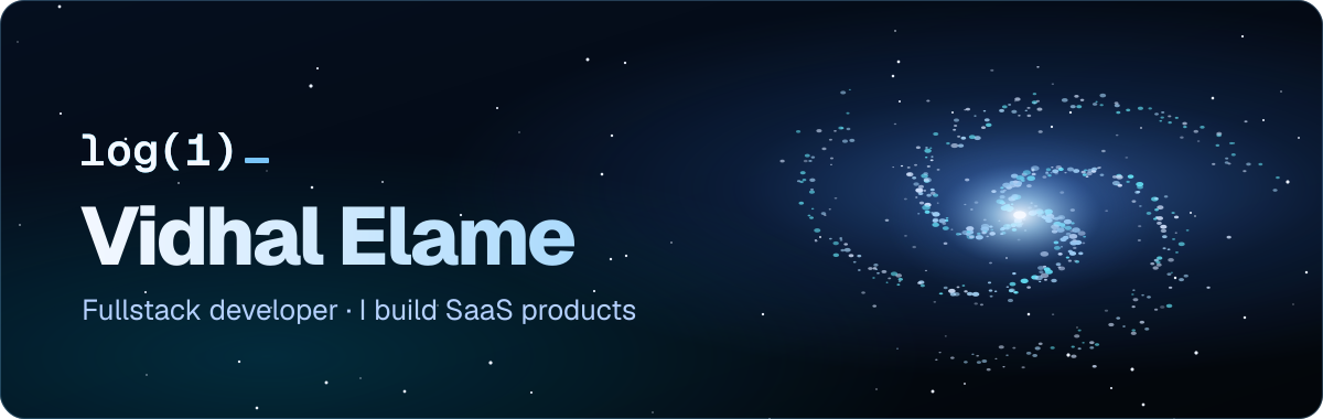
GitHub shows a README image as a plain <img>, so scripts never run. The banner is a single SVG animated with CSS keyframes: the galaxy turns, the stars twinkle, and the text is converted to paths so it keeps its font everywhere.
Logos that stay readable in dark mode
Many brand marks are black. On GitHub's dark theme they disappear. Each tile in my "Languages & Tools" table is generated, and dark marks get a lighter variant so every logo stays visible in both themes.
A scene for each theme
A visitor's theme can't be forced, but a <picture> element lets GitHub pick the right image on its own:
<picture>
  <source media="(prefers-color-scheme: dark)" srcset="assets/monument-dev-night.svg">
  <img src="assets/monument-dev.svg" alt="From localhost to production" width="100%">
</picture>
That is how the isometric tower shows a pastel day version in light mode and a night version, with the moon and lit windows, in dark mode.
The achievement badges
GitHub's achievements are earned through real activity, not settings. A few of them:
- Pull Shark — pull requests that get merged;
- Quickdraw — closing an issue or a pull request within five minutes of opening it;
- Pair Extraordinaire — co-authoring a merged commit;
- Starstruck — a repository that reaches 16 stars;
- Galaxy Brain — answers accepted in GitHub Discussions.
The honest way to collect them is the useful way: contribute to projects you use, open clean pull requests, and ship things people want to star.