





A few months ago I wrote here that I would never delete my opening animation: five seconds where marsile'Dev burned across the screen with a hundred particles behind it. I deleted it. This article is about why, and what I learned rebuilding the whole site.
What no longer worked
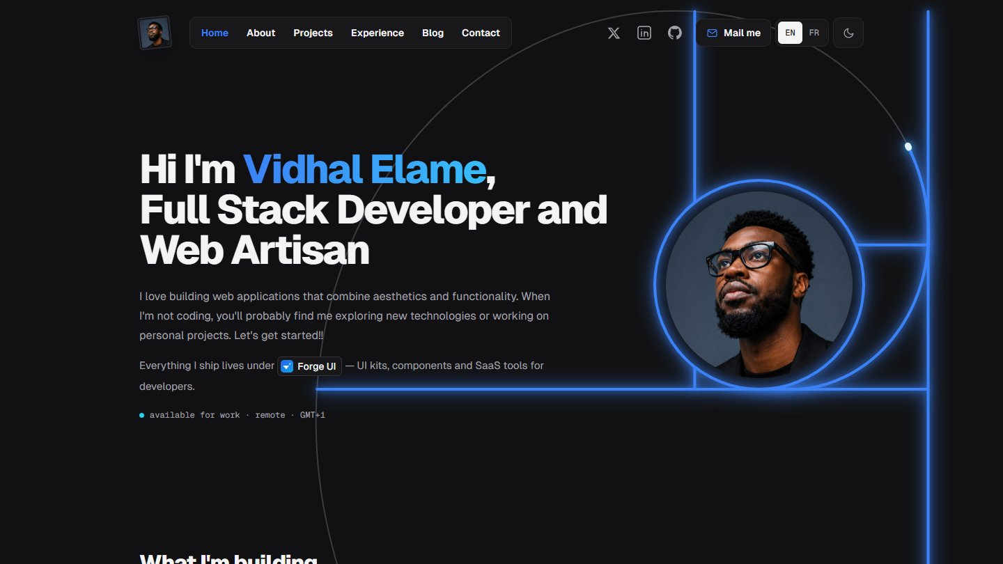
The previous site had many ideas, and that was its problem. A golden spiral in the hero, a whole theme built on the Fibonacci sequence, bands sliding on every page change, blue on every button, a green dot blinking to say I was available.
Each effect, taken alone, pleased me. Together they fought for attention. A visitor coming to see what I build first had to get through what I knew how to animate.
I had written that "rules are averages; portfolios are outliers". I still think so. But an outlier must serve the content, not walk in front of it.
The rule I gave myself
Just one: content first, in thin frames.
I took inspiration from two sites I like looking at: shadcn.io, and PrequelUI, which I build. What they share comes down to three things.
- A framed column. The whole site sits in one column edged by two thin lines, top to bottom.
- Grids with no gaps. Cards touch and are only separated by a line. You see a sheet, not a pile of boxes.
- Black, white and greys. Blue still exists, but it is rare: a hover, a focus, a few dots.
What I removed
- the opening animation and the transition bands between pages;
- the golden spiral and the whole Fibonacci theme;
- the blue buttons: the main button is white, the secondary one has a plain outline;
- the green "available" dot, replaced by a small label;
- the bottom navigation bar on phones, replaced by a menu that unrolls.
Removing is harder than adding. Every item on that list had cost me time, and I had defended it.
What still moves
A quiet site is not a dead site. I kept motion, but every effect now has a place and a reason.
- The hero's dot field. Waves leave my photo and light the dots they cross. It is the only continuous animation on the home page.
- Three line drawings. Next to the section titles, a small drawing in perspective plays once when it comes on screen, then stays still.
- The theme change. The new theme opens as a circle from the button you clicked.
- The globe. In the "My time" tile, it turns and settles on Douala.
- The hovers. A project screenshot goes from grey to colour, a pill glides under the menu link.
The difference from before: none of these effects delays reading. With reduced motion set in the system preferences, everything shows directly in its final state.
Mockups before code
The decision that saved me the most time: not touching the code before the drawing was approved.
I first made eight mockups, one per page, as plain HTML pages: home, about, projects, project page, experience, blog, article, contact. I looked at them, corrected them, sometimes refused them. The home page went through about ten versions. The experience block was redone three times before becoming a simple timeline by year.
All of that happened on throwaway files. When the drawing was right, the mockups' styles were taken as they were into the site: a single stylesheet, produced from them. So the site looks exactly like what had been approved, with no reinterpretation.
Changing your mind on a mockup costs ten minutes. Changing your mind on code in production costs a day.
What I take away
What you defend is not always what matters. I held on to my opening animation because it had cost me work, not because it helped the visitor.
A rare accent shows more. Since blue is no longer everywhere, it draws the eye wherever it appears.
Drawing first. Bad ideas should die on a mockup, not in the code.
The site you are reading is the result. Dark by default, light if you prefer, in French and in English. And with no opening animation.