





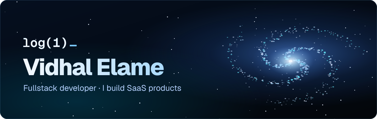
Why my profile needed a redesign
A GitHub profile is often the first thing a recruiter or another developer opens. Mine listed tools as badges and little else. I wanted a visitor to understand in five seconds who I am, what I build, and that I ship.
A GitHub profile is just a README.md file in a repository named after your username. GitHub shows it at the top of your page. All the work is getting the most out of that one file, by GitHub's rules.
What GitHub allows, and what it forbids
Before drawing anything, you need to know the ground. A README is not a web page:
- no JavaScript: scripts are stripped;
- no stylesheet: no
styletag, no classes; - a small subset of HTML: images, tables, links, the
alignattribute, and thepictureelement.
So everything visual has to go through images. The good news: an SVG is an image, and an SVG can carry its own CSS animations. That is the way in for everything else.
A banner that moves, without JavaScript
GitHub renders a README image as a plain <img>: no script runs. So the banner is a single SVG animated with CSS keyframes: the galaxy turns, the stars twinkle, and the text is converted to outlines to keep its typeface everywhere.
That last point matters more than it seems. In an SVG loaded as an image, a web font does not load: the text falls back to the default font of the visitor's machine. With the letters turned into outlines, the title looks exactly the same on every screen.
Five sections, in a chosen order
The profile reads top to bottom, like a home page:
- the banner, with my name and one sentence: fullstack developer, I design, build and ship SaaS products end to end;
- Languages & Tools: the tools I use;
- What I'm Building: four clickable cards to my portfolio, Blockforge, CV Malin and Logoforge;
- Always Shipping: an illustrated scene;
- Where to Find Me: LinkedIn, X, Ko-fi and my site.
The headings of those sections are SVG images too. It is the only way to get my own typography in a README.
Logos that stay readable in dark mode
Many brand logos are black. On GitHub's dark theme they vanish. Every tile in my "Languages & Tools" table is generated, and dark logos get a light variant so they stay visible in both themes.
The table holds forty tiles in five rows: languages, frontend, backend, databases, tools and cloud. Each tile is 48 pixels and carries the tool's name as a tooltip. A real HTML table keeps everything aligned, which a run of badges never does: each badge has its own width, and the line breaks anywhere.
The logos come from Logoforge, my open-source library of brand logos. Clean logos, at the same size, with a dark variant: exactly what a table like this one needs.
A scene for each theme
You cannot force a visitor's theme, but a <picture> element lets GitHub pick the right image by itself:
<picture>
  <source media="(prefers-color-scheme: dark)" srcset="assets/monument-dev-night.svg">
  <img src="assets/monument-dev.svg" alt="From localhost to production" width="100%">
</picture>
That is how the isometric tower shows a pastel daytime version in light mode, and a night version, with the moon and lit windows, in dark mode. The scene tells the job in one picture: a small developer climbs a tower, a bridge pivots, a lift raises him to a glowing gate. From localhost to production.
The same technique serves the section headings and the table labels: each image exists in two versions, light and dark.
What I removed
A profile is also judged by what you take out. The old banner was replaced. The "snake" that eats the contribution graph, I put aside: it is fun, but it says nothing about what I build. Fewer gadgets, more links to products that run.
The achievement badges
GitHub achievements are earned through real activity, not a setting. A few of them:
- Pull Shark: merged pull requests;
- Quickdraw: closing an issue or pull request within five minutes of opening it;
- Pair Extraordinaire: co-authoring a merged commit;
- Starstruck: a repository reaching 16 stars;
- Galaxy Brain: accepted answers in GitHub Discussions.
The honest way to get them is also the most useful one: contribute to the projects you use, open clean pull requests, and ship things people want to star.
To redo yours
If you want to get started, here is the order I would follow:
- create a public repository named exactly after your username, with a
README.md; - write one sentence first: who you are and what you build;
- put your projects before your tools, with links that work;
- prepare every image in two versions and serve them with
<picture>; - open your profile in the light theme, then the dark theme, and on a phone, before showing it.